NZ govt websites are wild and free - should we reign them in?
If you take a look at a handful of New Zealand government websites - take your pick, it doesn’t matter - you’ll quickly notice how different they are.
Different layouts, different features, different colours, different everything. Which makes sense, right? They are all trying to do different jobs for different customers.
But are they too different?
Well, that is what this article is going to explore, largely focusing on the look and feel of the websites at a glance. I am not even remotely any kind of expert in web design, UX or branding. So the purpose of this article is to examine the current situation, and offer some alternate examples from overseas.
All good? Let’s get started.
Below are the headers of eight government website I came up with randomly (honestly these were the first that came to mind).
They all look pretty clean and professional and feature a logo on the left and a menu or search bar of sorts in the middle or on the right.
Most also feature both their English and Māori names, while two of the examples use the government crest.
Scroll further down and we get nice imagery and some useful quick links - but (like the headers) very little to indicate they are all government departments.
Things get looser.
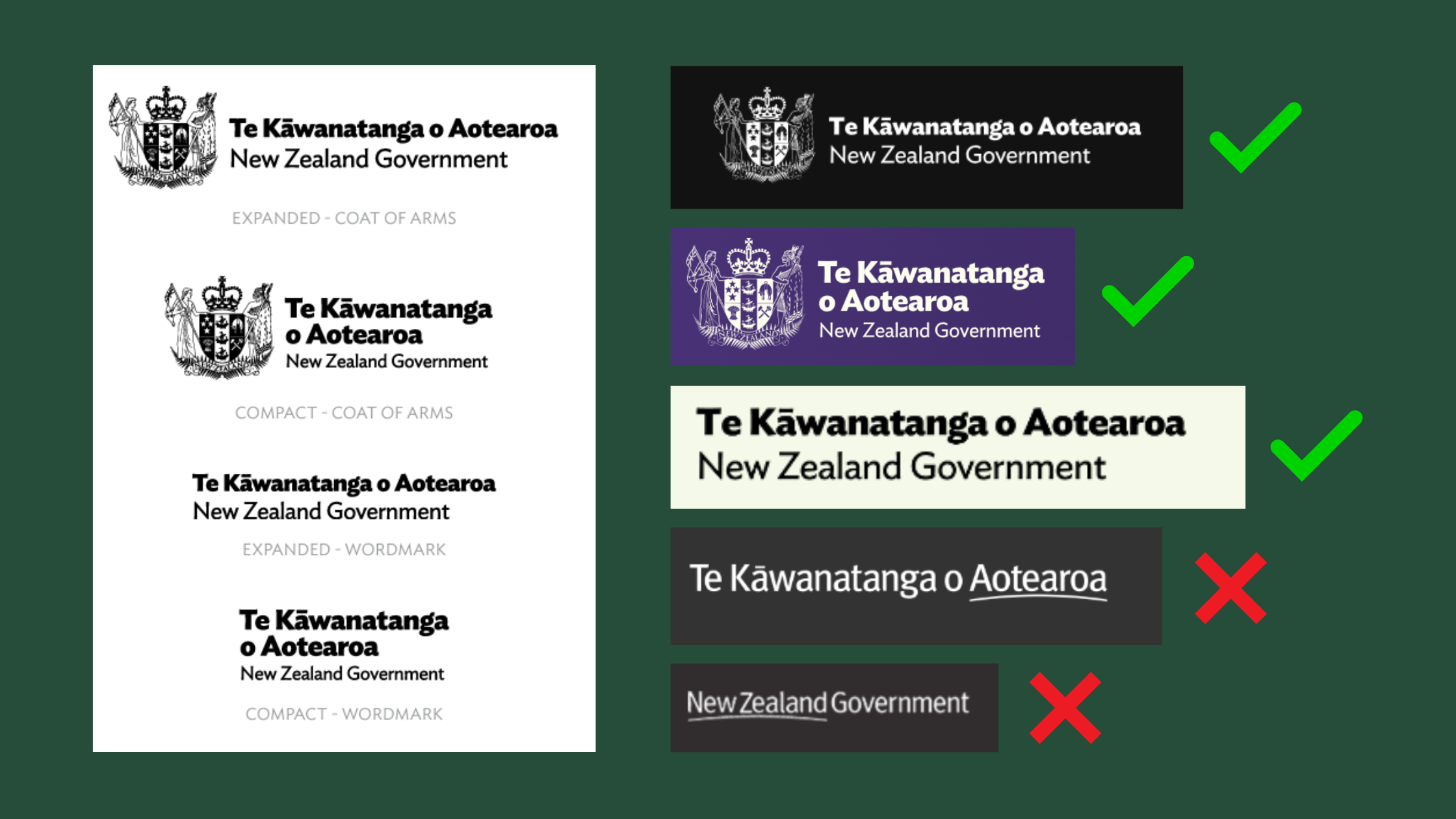
If you look more closely, you’ll discover that not all the websites use the correct government logo.
The official guidance from the Public Service Commission’s ‘New Zealand Government Identity’ technical style guide is below on the left. On the right are some current web examples which seem to follow the rules, along with a couple of the old ‘swoosh’ logos which should have been given the boot years ago.
And the broken rules don’t stop there.
I didn’t know what a favicon was until I built my own website, but it is the small icon associated with a particular website or web page. It appears in various places, including in browser tabs next to the page title, helping users quickly identify the site.
Again, there is official guidance for favicons, stating that for government websites (using the .govt.nz suffix) they should be a little ‘NZ’ icon.
But (surprise, surprise) almost no government websites do this, instead opting for their own little logos or designs related to their unique brand.
But wait a minute, does any of this matter?
Well, our wild and free way of doing things is very different to some countries overseas.
For starters, in the UK for example they don’t have hundreds of separate, independent government websites. Instead, back in the 2000s they started bringing them in under a few big umbrella sites, with www.gov.uk hosting a staggering amount of info from a staggering number of organisations.
Across the ditch, a lot of Australian government websites have similar design elements and branding - at least in the headers. Look below and you’ll see a bunch of different headers, all bearing the government crest as well as approved favicon.
This isn’t surprising to me, as both Australia and the UK both have excellent, centralised comms guidance, with the UK’s Government Communication Service (which has its own website) particularly impressive, authoritative and useful.
Then there is the French model, where things are even more uniform - including for use of colour and the website headers which proudly display the famous tricolor along with an outline of Marianne, the personification of the French Republic.
It’s far from perfect, with font sizing differing from site to site (as you’ll see below).
But they do look largely alike, so much so that you would quickly recognise you were on a government website if you found yourself looking at a website which resembled the below.
Which is the point, right?
In the United States they appear to have gone down a different path. There, the websites are unique (although most feature official insignia of some kind).
But they also feature a strip at the very top of the page which alerts users to the fact the site is an official government page.
You can see examples below from a range of websites, including the Department of State, Homeland Security, and Department of the Treasury.
The strip features a US flag, and the words: “An official website of the United States government”.
Next to that is a clickable drop-down ‘Here’s how you know”, which reveals information around the .gov suffix and the secure ‘lock’ icon which indicates a secure connection.
Zoom in a little and it looks like this.
All of which brings us back to New Zealand, and our wildly unique government websites which bear no resemblance to one another and give very little indication that they are, in fact, linked to the government at all.
Should we be reigning them in? Should someone, somewhere be letting these departments know that at the very least they should do what the extremely limited guidance suggests they must?
Perhaps.
In terms of the available guidance, digital.govt.nz seems to be largely about accessibility and content design, while the Public Service Commission has guidance on using the ‘New Zealand Government Identity’. The latter is pretty narrow and pretty light on detail.
In France, they balance strong guidance on accessibility and content design with equally strong guidance on brand - for strategic reasons.
“Whenever the state is present,” the guidance reads, “its presence must be clearly identified”.
The point is to make it easier to “identify and recognise the state” in action via a “unique but flexible brand” that connects citizens through both history and shared values (liberty, equality, freedom).
This might be a step too far for New Zealand (it feels a bit forced and cheesy?) but it displays a level of strategic thinking at a national, long-term level that generally seems pretty absent in our communications.
At the very least, it’s food for thought, right?
What do you reckon? Comment below or email me@seamus.nz


